

This project revolved around the creation of a program for a local nonprofit. CASA caught my eye for what they represent and do, helping children in need, specifically by providing mentors who help raise them up. Their mission statement says it better:
Court Appointed Special Advocates (CASA) of South Central KY, Inc. is a non-profit agency dedicated to preventing and eliminating further trauma to children. Specifically, CASA works to prevent child victims of abuse, neglect and dependency from being abused both in and out of their family of origin. The CASA concept is based on the commitment that every child has the right to a safe, permanent home as soon as possible.

Step 1 - Research & Inspiration
-
What is most needed?
• Volunteers
• Representatives
• Donors
-
What are the key characteristics?
• Dependable
• Mature
• 30-60 years old
• Empathetic / Loving
-
How do we bring these people in?
• Informative statistics
• Fun interaction
• Group / Communal acivity
• Accountability
One of the biggest issues for CASA is volunteers, that is their mentors. What kind of program would be enjoyable enough to bring people in and yet also make a big enough impact to keep them around?
My answer to this question was “Lets Build”. A monthly program centered around the building, connecting, and growing of volunteers, representatives, and donors with the needs of local kids and youth. Through a time of play, this program brings laughter and joy, which helps instill long lasting relationships and unforgettable memories.
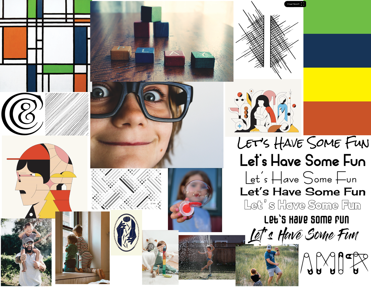

Moodboard & Logo Development.
The moodboard for this project centered around fun, playfulness, and inviting. The name of the program at first was “Lego Build” a play on pronunciation of “Let’s go Build” & “Lego Build”. However copyright issues with the brand name “Lego” & the ambiguity of its meaning caused me to try another route.
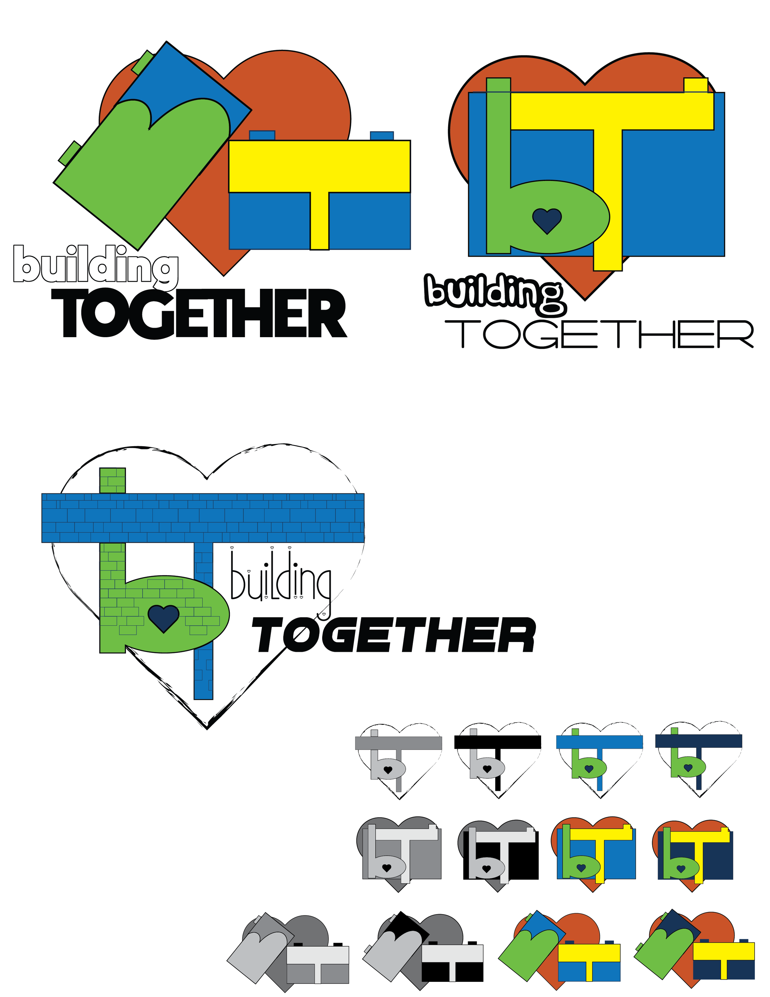
The first “Building Together” stated the intentions of the program straight forward. The attempts at pulling something from the BT was fun to try and conquer. However the name, in the end, was a mouthful to say, didn’t have a good flow, and these would make it hard to be successful.
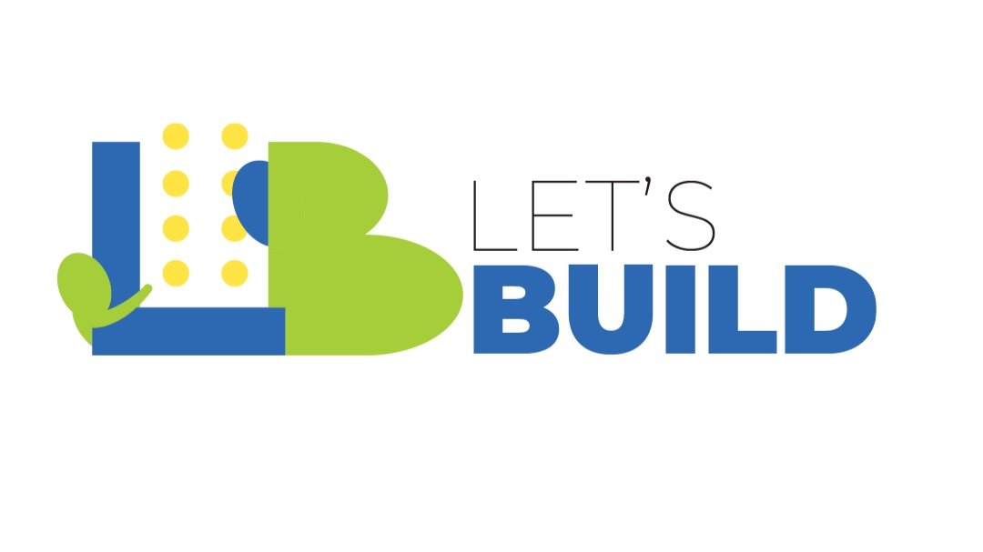
“Let’s Build” was going back to my original design. Its short, to the point, and great “call to action” proved solid ground for the brand to be built upon. The play of the first two letters, the negative space in between and the introduction of a child reaching, and an adult head brought clarity to the intent of the logo.

It all comes together…
The brand board brings the final components of the brand together, the main logo & its variants, the color scheme, and font pairing.
The variants of the main logo bring versatility in both orientation and composition to the brand. These differences permit consistency across a variety of mediums, from social media feeds to merchandise. The stacked, the horizontal, and the vertical permit the logo to be present in whichever way is best needed for the benefit of the whole.
The color scheme displays the underlying themes of the brand itself. The blue references trust & commitment, green pulls growth & safety, and yellow brings hope & positivity.
The font Montserrat brings structure with a sense of informality. This san serif family has the ability to be something which looks solid and sturdy while not being intimidating, more likely welcoming. The contrast of using the light and the black is a direct reference to the building process and the contrast helps garner the viewers attention.
Step 3 - Web Landing Page
With the brand components finalized, the next step was the creation of a web landing page for “Let’s Build”. The use of a wireframe helped quickly sketch down the layout and allow the ability to easily alter, after the wireframe was completed, it became the basis for the style tile. The style tile is much like the mood board and allows a basis for what the web landing page could be, the benefit of this was what it pointed out to me.


Final Web Landing Page
The creation of the style tile, showed how the green header didn’t work well with the logo and lacked contrast. Also the buttons, their layout, and the font used came across as a bit to childish. The target audience remember was between 30 and 60 years old (give or take), and this while cute was more for an elementary student than a working professional. The beauty of the style tile was how it allowed one to quickly see how to refine and improve the areas without a whole lot of time invested into a design.
The lessons taken from the style tile allowed the opportunity to clean up and better bring consistency to the page. The change of the header from green to blue brought a better contrast and helped tie in the colors of the info graph below. The change of the buttons to the familiar rectangle bring more stability to the page and allow contrast with the circle images below. The simple three grid layout for the “Call to Action” pulls the viewer down the page with a slight abstract reference to three people, the circles being the head and the copy becomes the neck and body. The info graph certainly grabs the viewers attention and the contrast to the icons below and their negative space allow a moment of breath and relaxation as one is warmly welcomed into navigating the other areas of the website.


Step 4 - Mobile App
The mobile app was completely centered around interaction, specifically the interaction between the user and their “little builder”. Trying to facilitate all the ways possible for the user to communicate to their little builder, this app streamlined the process for ease of use and privacy. The app also garnered administration the ability to quickly see what was being transmitted, how often, and what needed to be improved or reduced for the better of all involved.
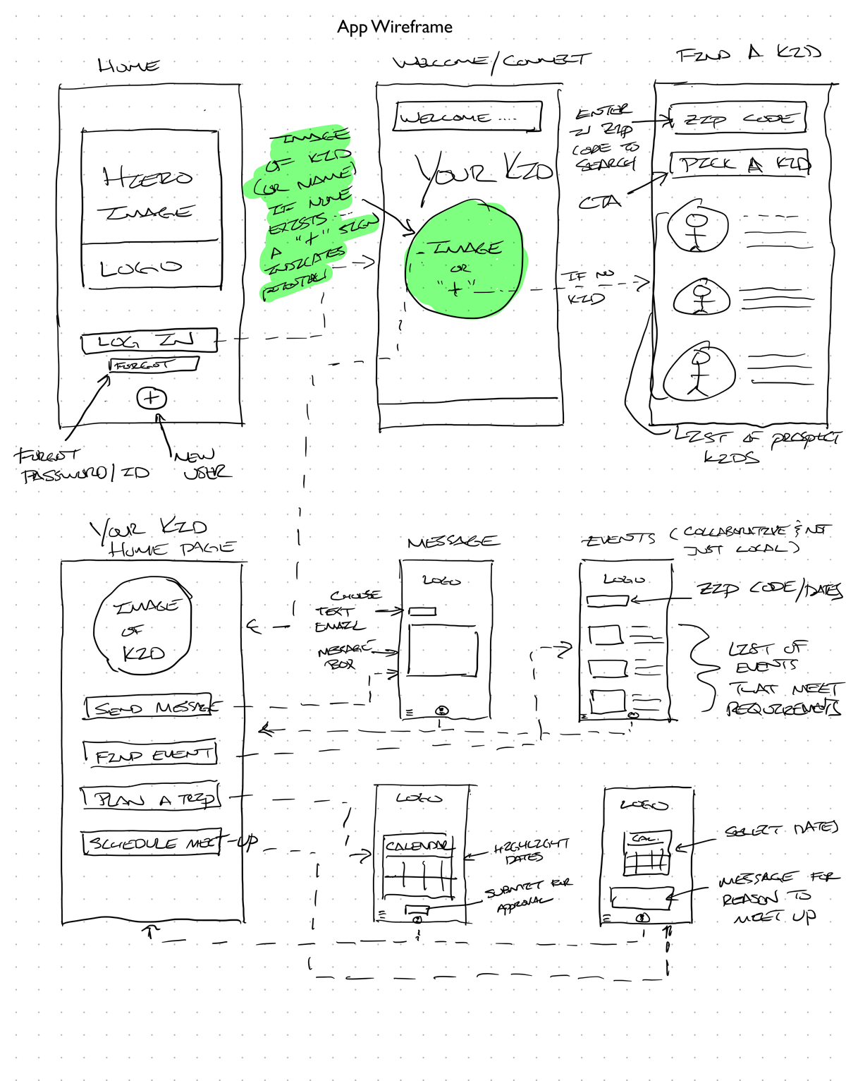
The wireframe provided an excellent starting point on how the user could best navigate a successful integration with a “little builder” and all the ways into which their relationship could blossom and build. The video below shows the final app prototype.