
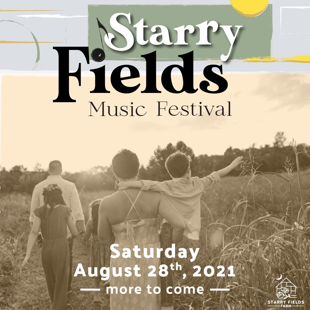
Starry Fields Music Festival
In the summer of 2021, the opportunity was given to our class, to help a local business in the creation of a new visual brand.
Based outside of Bowling Green, KY, “Starry Fields Farm” wanted to start an annual musical festival for its community, our responsibility was in getting to know the client and facilitate a visual brand that meets their desires.
This was an invaluable experience for it provided not only the opportunity to work along and with the client, but it also provided the students with the ability to see how other classmates were choosing to create their brands. This started with a client brief, a logo development, a poster, social media posts, and finally some merchandise.

The Starting Point
The client “Starry Fields Farm” filled out a client brief stating what it was that they best captured who they are and what they represent. Key things that they wished to build an identity from were: BOHO, woodcut, folk art, funky, and the outdoors.

From these I started my creative process by trying to define which each of these characteristics represented. This more clearly defined areas of influence and inspiration allowed me the opportunity to create a moodboard to pull from for the creation of the brand.
The First Drafts of Possibilities
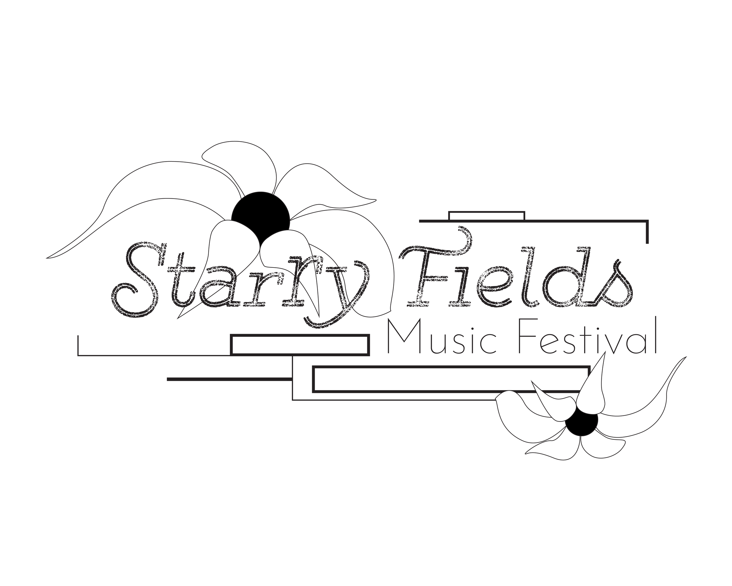
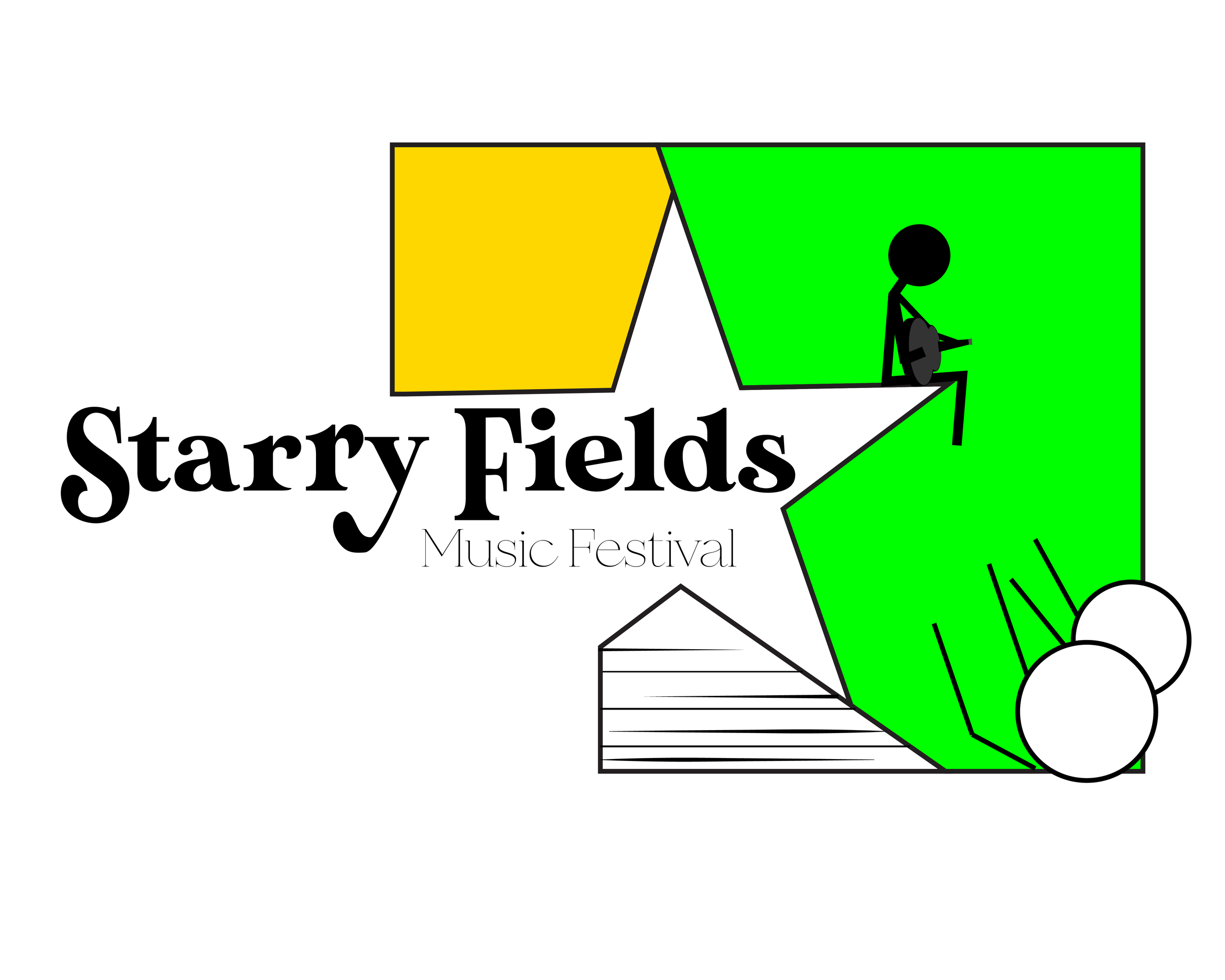
Taking the inspirations from the mind mapping and moodboard, I decided to work upon the creation of three different platforms for the logo to rise from. Using the Starry Fields logo, I incorporated the geometric qualities into the first design. The combination of rectangles and lines accented by different weights and the flowing contours of the flower petals bring a dynamic tension to the overall composition. The second logo focused on activating more of the negative space and bringing more of a “woodcut” feel, with the inclusion of easily identifiable music festival symbolism.
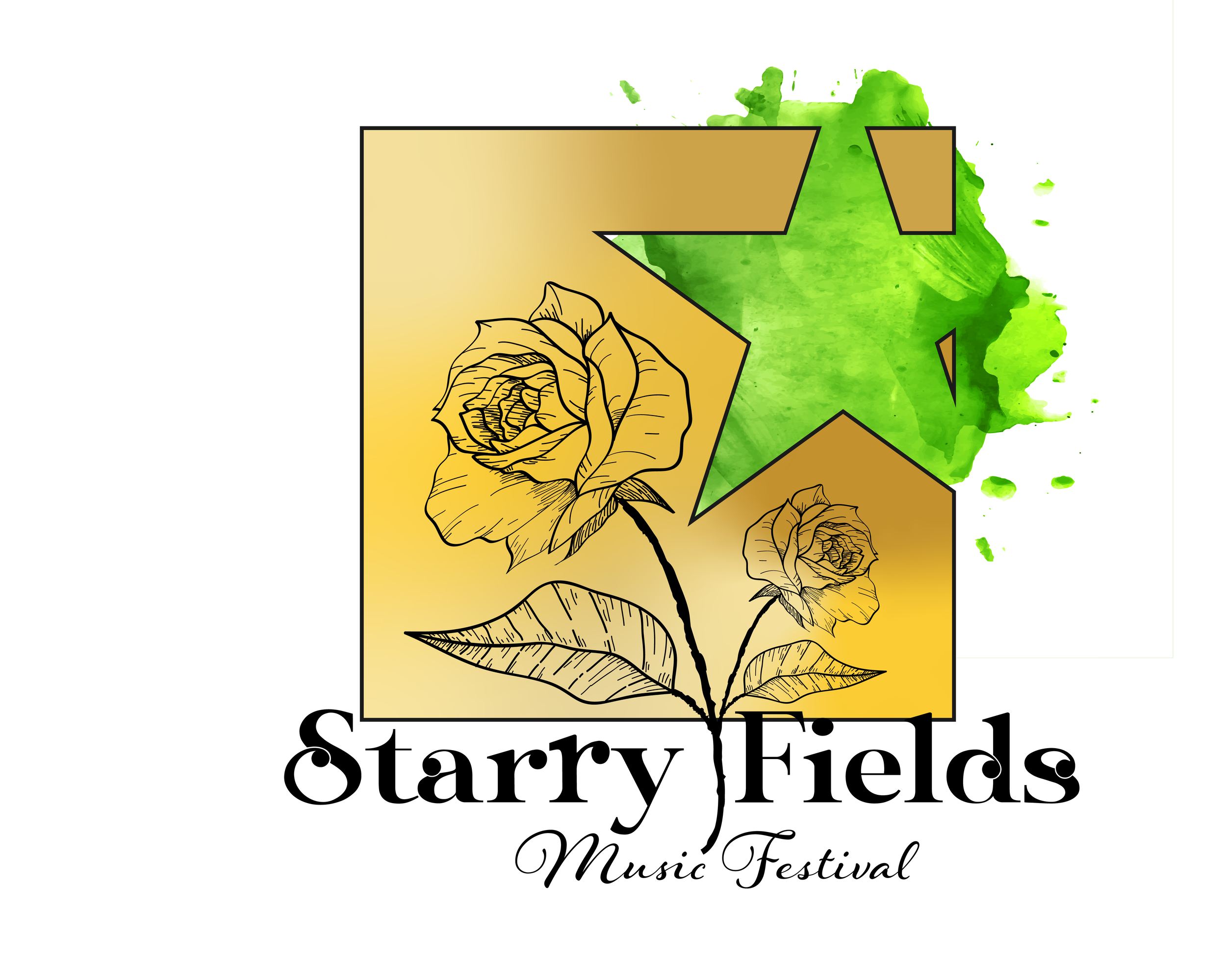
The invading negative space and the overlapping were included to represent the nature of the music festival as something different and communal. In the final logo design a more stamp approach was brought forth, the simple design overlaid with a rose flower brought forth the woodcut feel once again. The negative space of the star, exploding with color, references the dynamism of the music festival. The font combo brings forth the organic flow combined with the soft touch of personality.
The selection

Final Logo
In meeting with the client, they were torn between the possibilities of the first two options and the final selection was made to move forth with the first. Subtle cFine tuning the layout, bringing forth more character to the lines and the inclusion of finer detail to the flower provided a final logo that accented its original intent. Morphing the dot of the “i” into a musical note helped reinforce the intent, and the slight tilt of the note exhibits a playfulness. A slight change to the lines over “Fields” was made to portray a stage with a microphone on it, while abstract and simplistic this subtle addition helps balance the composition and also reads as a landscape right above the word field.
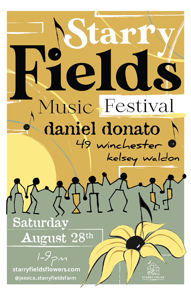
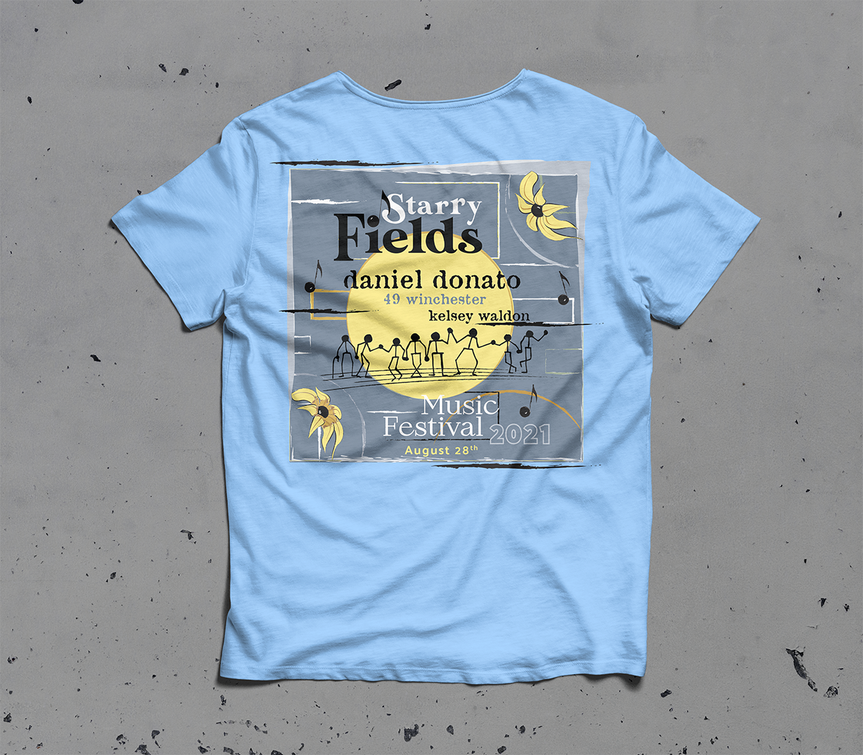
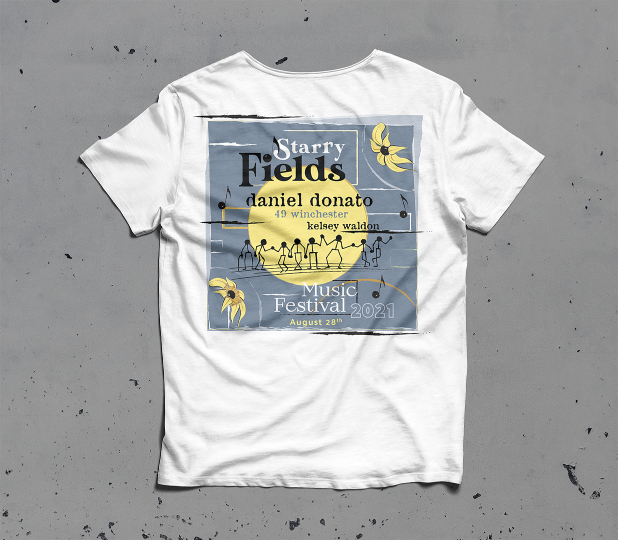
Merchandise.
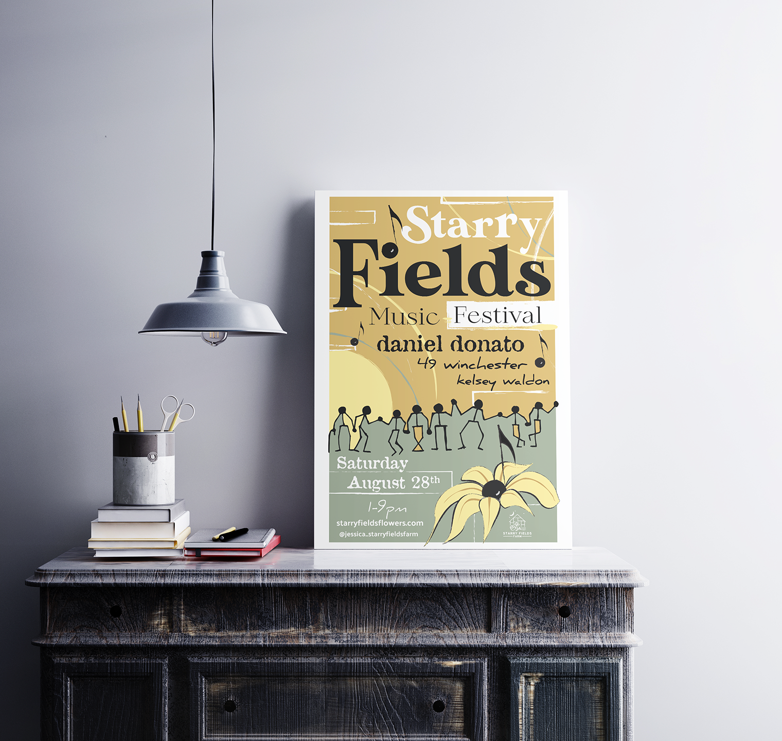
Once the decision was made for the brands logo, the next steps were in the creation of a poster to help advertise the Starry Fields Music Festival and also wearables that would help advertise future events and be an ownership item of sentimental value for the customer. The introduction of an alternative logo format on the front of the t-shirt along with a slight difference to the poster on the back encourages the accumulation of both items. The hat as well displays an ulterior logo form and thus entices people to purchase it as well. The slightly different layouts not only encourage the purchasing of all, but also show brand continuity in form, shape, and color.


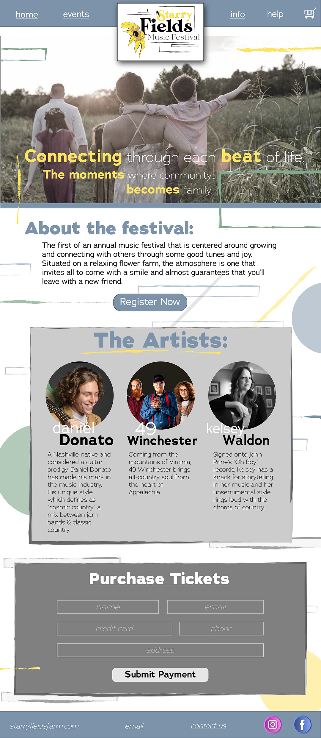
Web & Social Feeds
The creation of a web landing page was centered around the family friendly environment the customer wished for. The lowercase and thin navigation menus create a soft, pleasant, and welcoming way in which to move around the website’s potential pages. The color scheme was centered around that of the poster and mercy and helps demonstrate brand consistency in different formats. The alternative logo, which is also present on the front of the t-shirts, helps establish presence when the page first loads, its rectangular shape spiced with a drop shadow immediately brings the viewer’s attention to it first, followed by the hiero image underneath.
The color scheme and shapes throughout the web landing page are also found on the social media feeds and once again help tie it altogether. The images selected for each artist were chosen directly for their demeanor, that is smiling, inviting, and friendly. These images paired with the font choices for each artist name help further show the brand’s characteristics. The first part of each name is a handwritten copy that personifies personality, freedom, and authenticity. The second part is a thick but friendly san serif, which shows structure, security, and presence while still hinting a friendly vibe.


So what was the takeaway?