“2019”
The year was 2019 and these projects were a great opportunity to learn the basics of Photoshop, Illustrator, and InDesign. The opportunity wasn’t missed and so I pushed my creative limits to venture into new grounds and see what could be made or lost, lol.
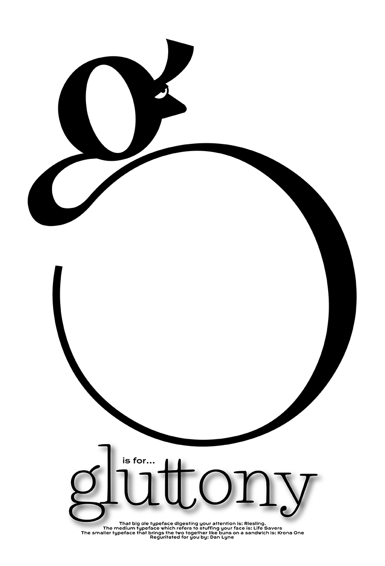
The “G is for Gluttony” highlights the form of the lowercase “g” in the riesling font and with the addition of a simple eye and nose the figure comes to life. The lower copy has my copywriter taste where I have some fun with informing the viewer of what fonts were used in the creation of this piece.
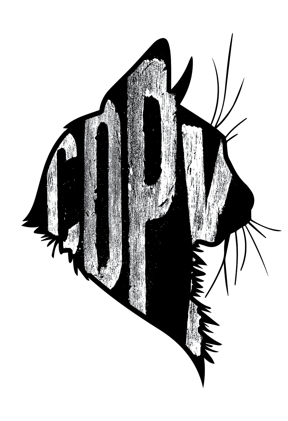
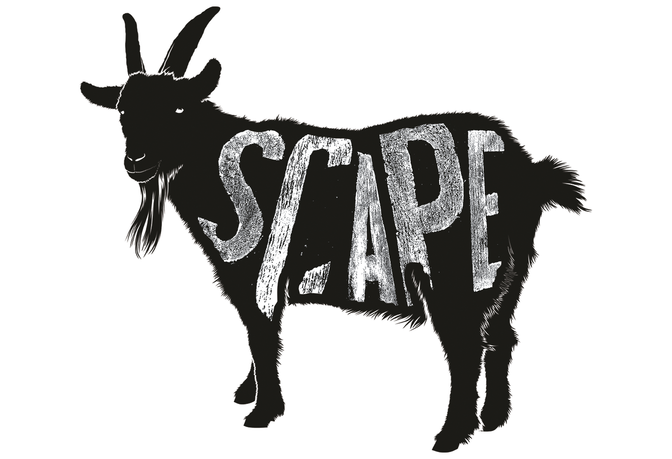
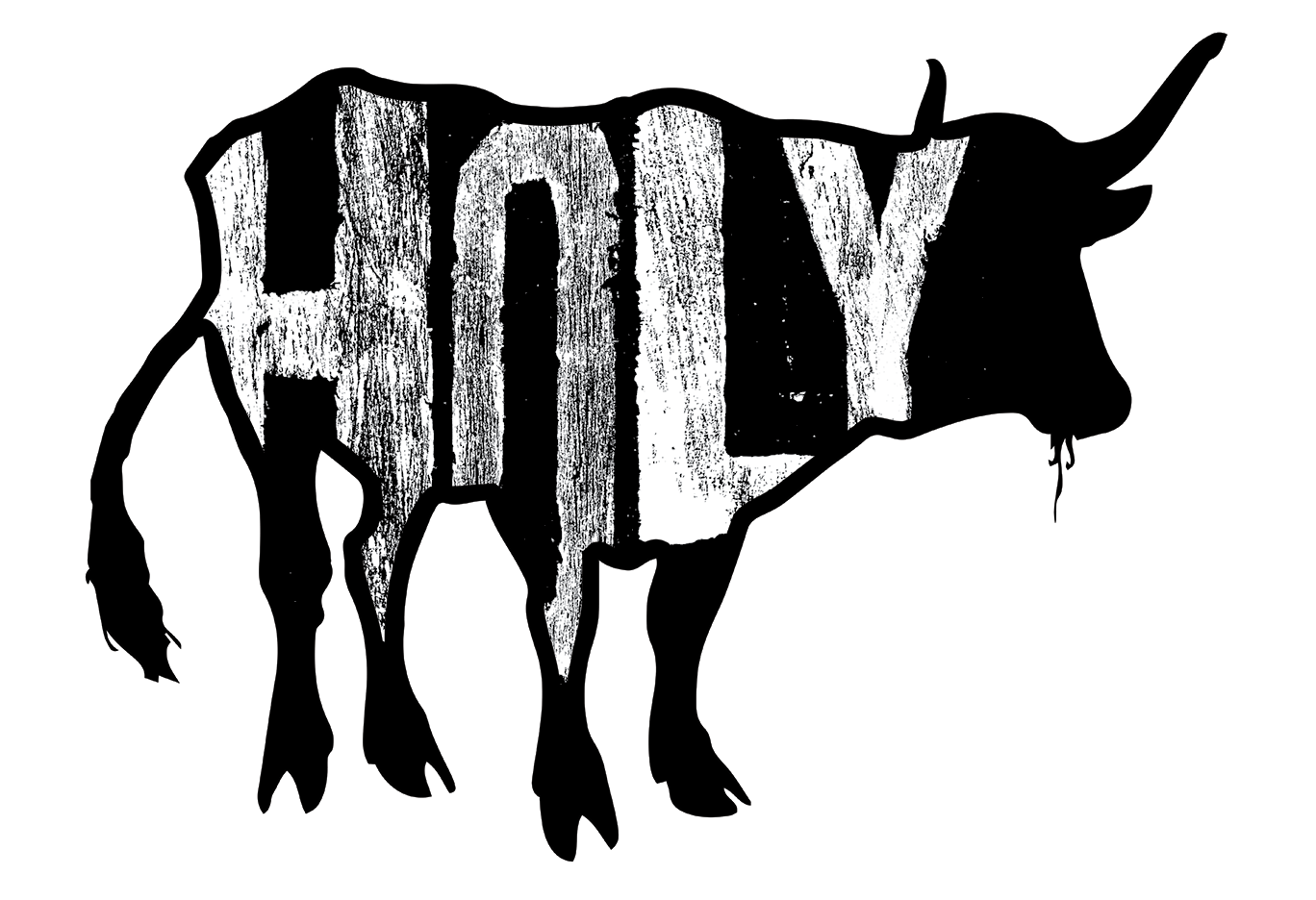
The “branded series” was done in the fall of 2019 and brought a different avenue of attack where I used common idioms with the silhouetted animal in place of what a “grouping” of them was called.